

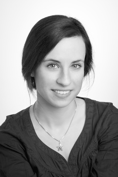
Antonia M. Cornelius (*1989) is a german type and communication designer, lecturer and researcher with a special interest in legibility and readability. Her work is driven by the fascination of how design can react to the limits of our perception and thus significantly influence reading under certain circumstances.
Already since her bachelor studies in communication design with Jovica Veljović at the Hamburg University of Applied Science Antonia pursues this research question. In the end she completed her bachelor’s with her book “The Letters in my Head. What Creatives should know about reading processes in order to design joyful reading experiences”. The compendium is about designing typefaces as well as their typographic usage with focus on legibility and readability. With her book, Antonia succeeds in interweaving centuries-old design knowledge with recent scientific findings. It was later published by Hermann Schmidt and shortlisted at “Die schönsten deutschen Bücher” by Stiftung Buchkunst.
Antonia seamlessly continued her master’s in communication design with Veljović and followed up on her research approach. While designing her Legilux typeface family (a transitional serif with optical sizes as well as a sans serif) on the one hand, she doves even deeper into the field of scientific legibility research on the other. Additionally mentored by Albert-Jan Pool a legibility investigation was undertaken in order to test i.a. the emerging typeface in running text. At the end of 2017 Antonia graduated and was honored for her outstanding research based type design work.
In 2016, a very first version of Antonia’s Legilux typeface was already recognized at the Morisawa Type Design competition, winning the first public choice award.
Right away after her master’s degree Antonia joined Dutch Design for extending the FF DIN family with FF DIN Slab. Furthermore, she re-engineered the whole FF DIN family itself for its transition to the variable age, also adding Bulgarian Cyrillic and other characters. Last but not least she ensured that FF DIN Stencil made its way through the jungle of becoming a functional three axis variable font, behaving agile through the design space with several specialties.
Since 2018, Antonia has been sharing her knowledge in various ways: teaching type design at Muthesius University of Fine Arts and Design in Kiel, speaking at conferences and in-house events, writing articles as well as providing consultant services on issues regarding legibility and readability.
Meanwhile, her spirit of research has led her to the question of whether and if so, which characteristics of typefaces (e.g. serifs, stroke contrast, optical scaling) influence the speed of reading running text.
Publications
Researcher IDs: ORCID 0000-0001-9807-3205 // GND: 1143840798
Compendium: The Letters in my Head. What Creatives Should Know about Reading Processes in Order To Design Joyful Reading Experiences (written in German: “Buchstaben im Kopf. Was Kreative über das Lesen wissen sollten, um Leselust zu gestalten.”). Mainz: Hermann Schmidt, 2017.
Article: “Design of Legible Typefaces — How To Utilize Research” (written in German: “Gestaltung von leserlichen Schriften – Was nutzt uns die Forschung?”) In: Lesbar. Typografie in der Wissensvermittlung, Ulrike Borinski, Rudolf Paulus Gorbach (ed.) 233 – 237. Zürich: Triest, 2019.
Article: “How Design Can Influence Reading Experiences” (written in German: “Wie Gestaltung das Lesen beeinflussen kann.”) In: FURE Magazine. Issue 1. Rüdiger Quass von Deyen, Patrick Marc Sommer (ed.). Münster: 2022.
Talks
I regularly give talks on legibility, readability, reading processes, type design, typography and legibility research.
Upcoming
April 6, 2024 — Zürich:
The School for Design “Schule für Gestaltung Zürich” invited me to its annual event “Tag der Schrift”. I’m looking forward to talk about legibility and all the various aspected related to reading comfort as well as giving a workshop on variable fonts!
Selection of recorded talks:
ATypI Antwerp: Legibility Research Today. Characteristics of typefaces in focus. (EN)
TYPO Berlin: The Letters in my Head. How Design Can Influence Reading. (GER)
See full list of talks and publications.
Awards
2017: Honored Master Thesis by Center for design research (ZfD) of University of Applied Science Hamburg for the interdisciplinary legibility research approach.
2016: First Public Choice Award Morisawa Type Design Competition (Tokyo, Japan) with a first version of Legilux.