

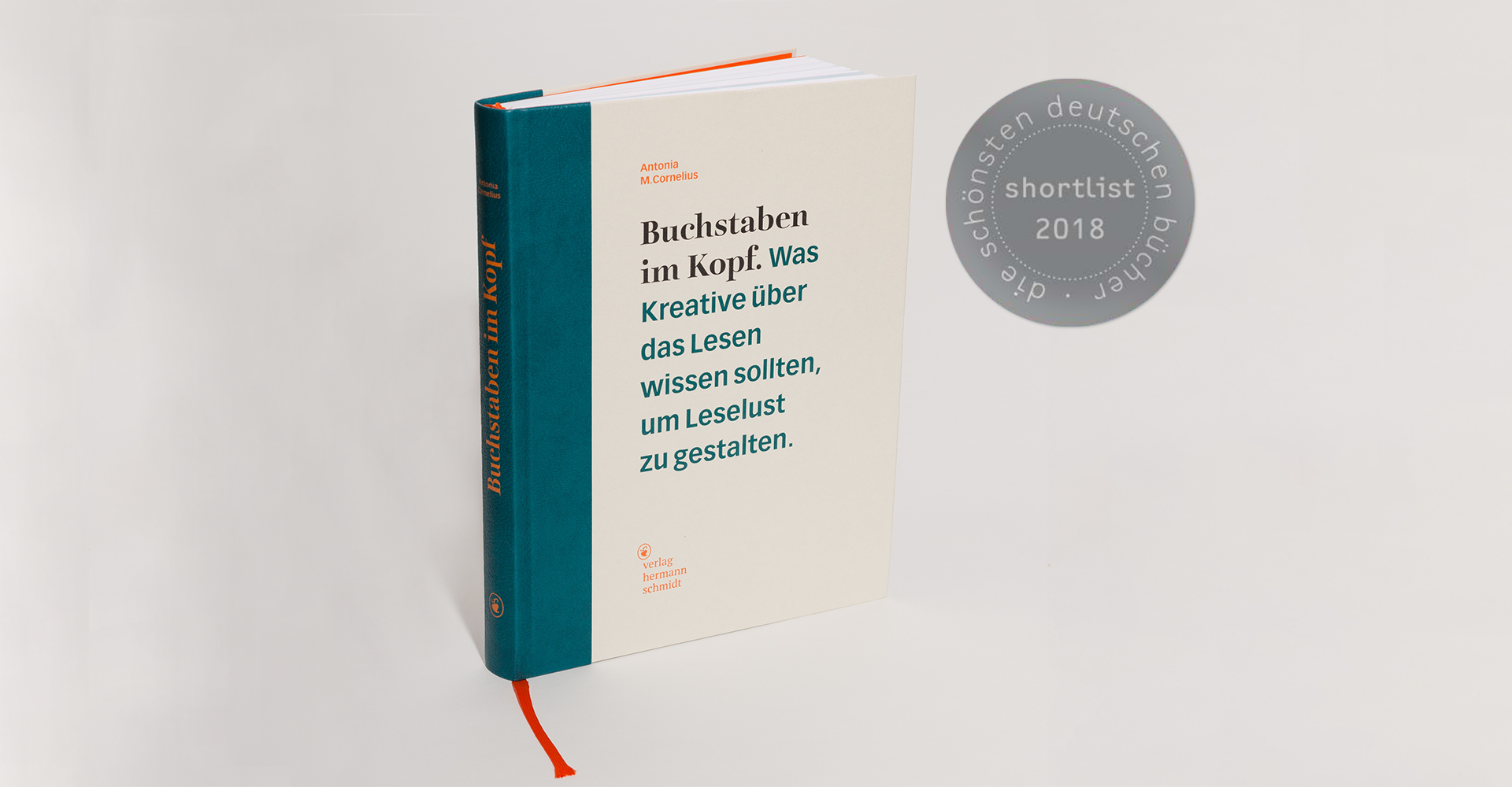
“The Letters in my Head. What Creatives Should Know about Reading Processes in Order To Design Joyful Reading Experiences.” was published in German by Hermann Schmidt in 2017.
(original title: “Buchstaben im Kopf. Was Kreative über das Lesen wissen sollten, um Leselust zu gestalten.”).
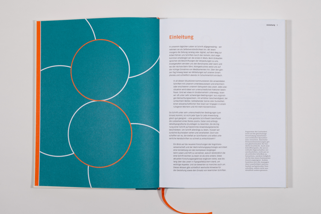
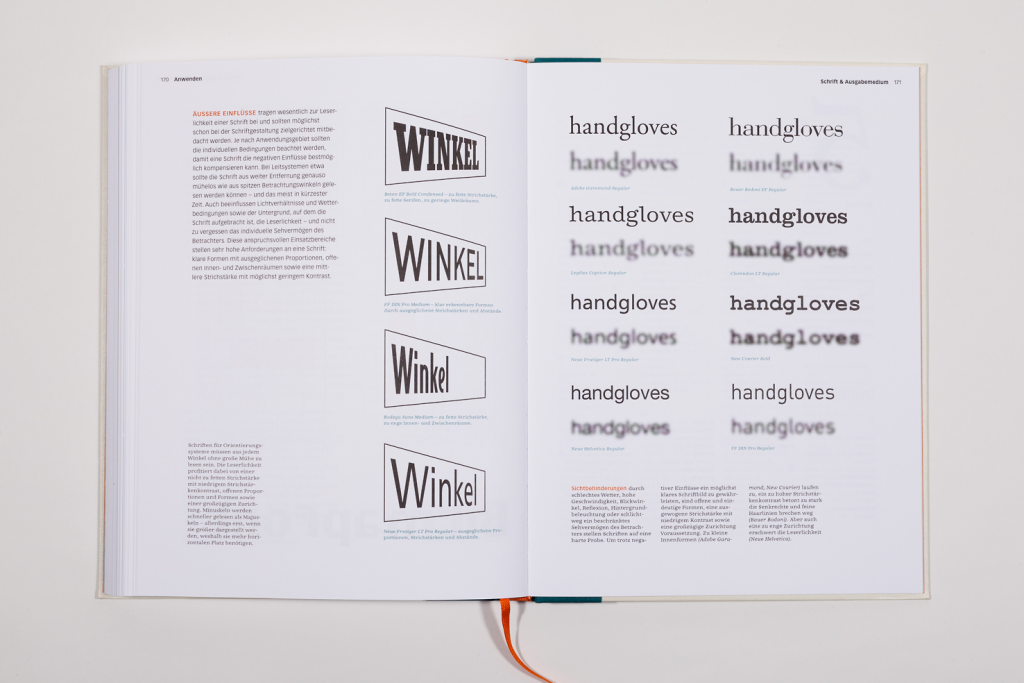
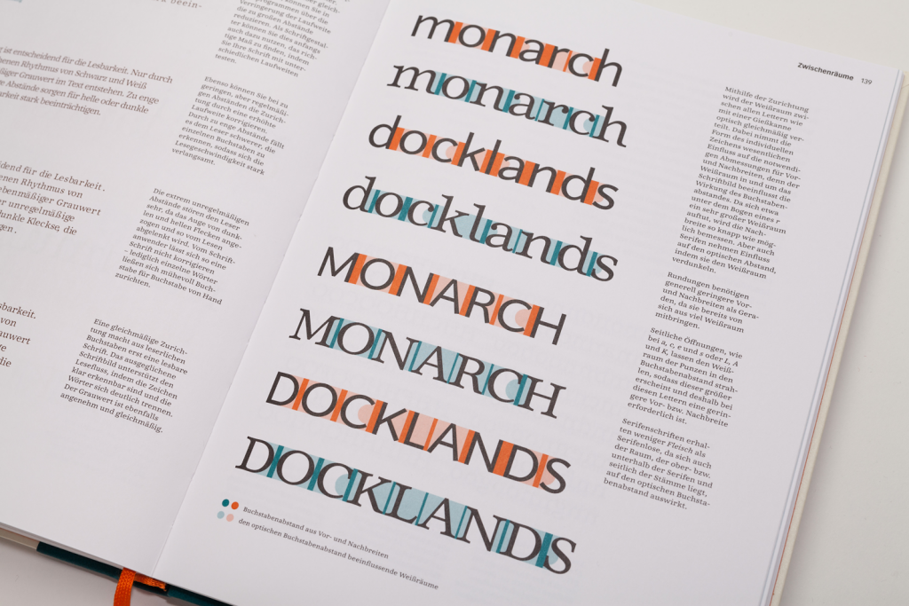
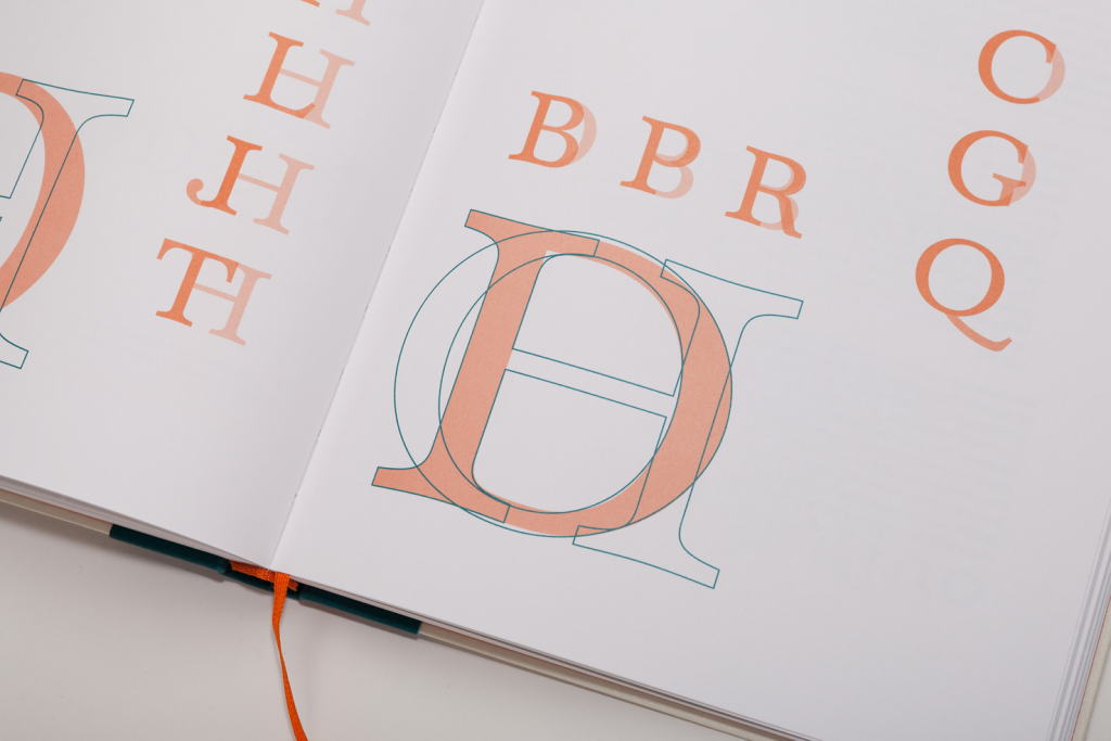
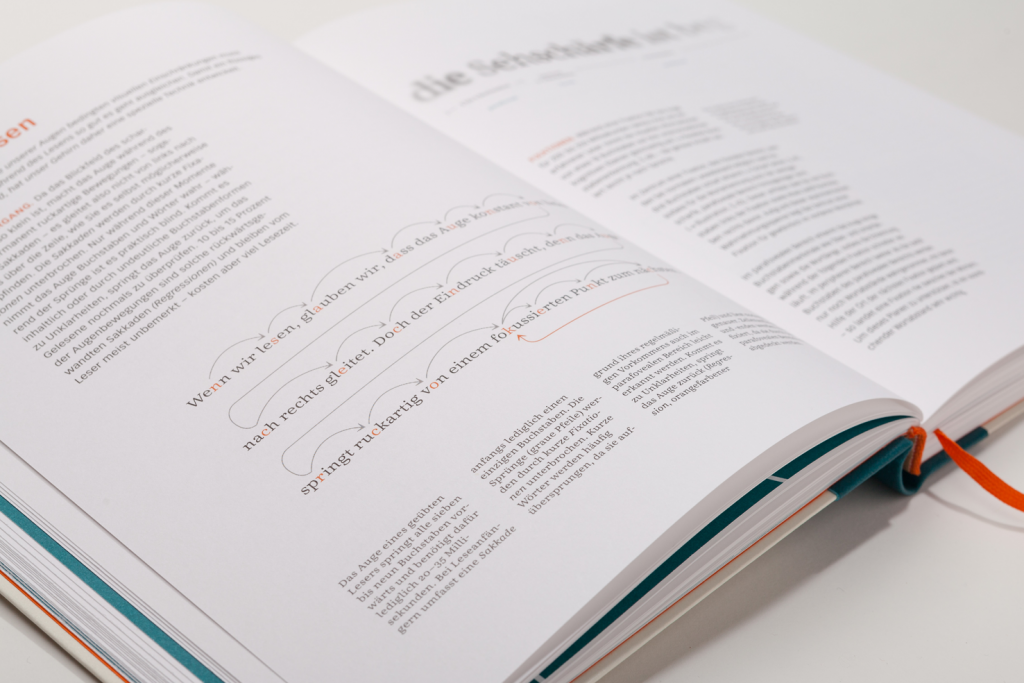
It’s a compendium about designing typefaces as well as their typographic usage focusing on legiblity and readability. Recent findings from reading and readability research are made accessible to desigerns and interwoven with the knowledge from the field of design that has grown over centuries. Getting an idea of how we actually see and how complex the reading process is helps to understand which design parameters influence reading comfort under certain conditions.
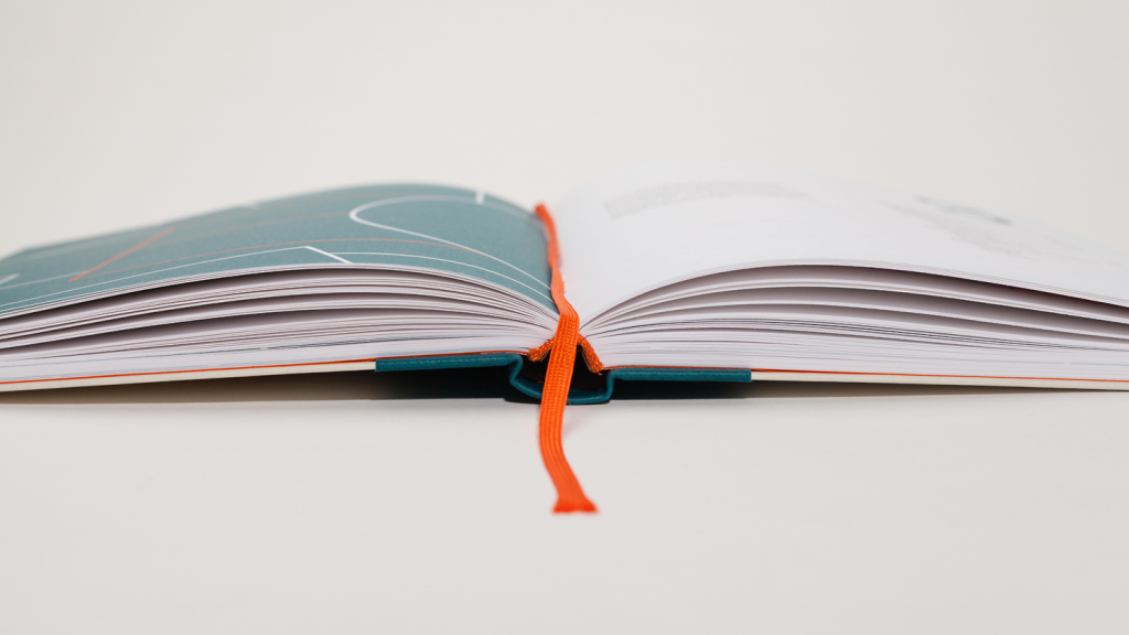
In this book the Legilux typeface family passes its very first crucial test: all annotations and captions are set in the upright and italic caption cut for smallest point sizes. The titel is set in Legilux Serif Display Black. Remaining optical cuts (text, subhead, headline) as well as the sans serif version can be seen in numerous illustrations.
The book was shortlisted at “Deutsche schönste Bücher” for its distinctive design in 2018. Furthermore it was under the finalists at Joseph Binder Award 2018.

In conversation …
→ with Katrin Weller in “Kultur am Mittag”, broadcast by WDR 3 (2017-11-06):
→ with Patrick Marc Sommer at Design made in Germany:
“Buchstaben im Kopf – Fragen an die Autorin Antonia M. Cornelius” (2017-11).
In short
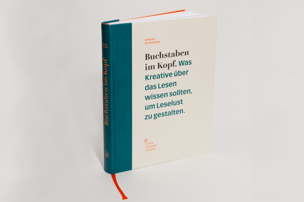
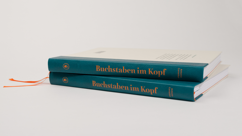
Antonia M. Cornelius
Buchstaben im Kopf
Was Kreative über das Lesen wissen sollten, um Leselust zu gestalten
180 pages
with more than 500 colored illustrations and typeface specimens
printed continuous with three special colors
format 18,7 x 25 cm
thread stichted flex cover
Euro 35,–
ISBN 978-3-87439-895-4
Published in Oktober 2017 with Hermann Schmidt.
In the web
Muthesius University of Fine Arts and Design Kiel
Zeilenhacker: »Warum man Deutsch viel leichter liest als Englisch«