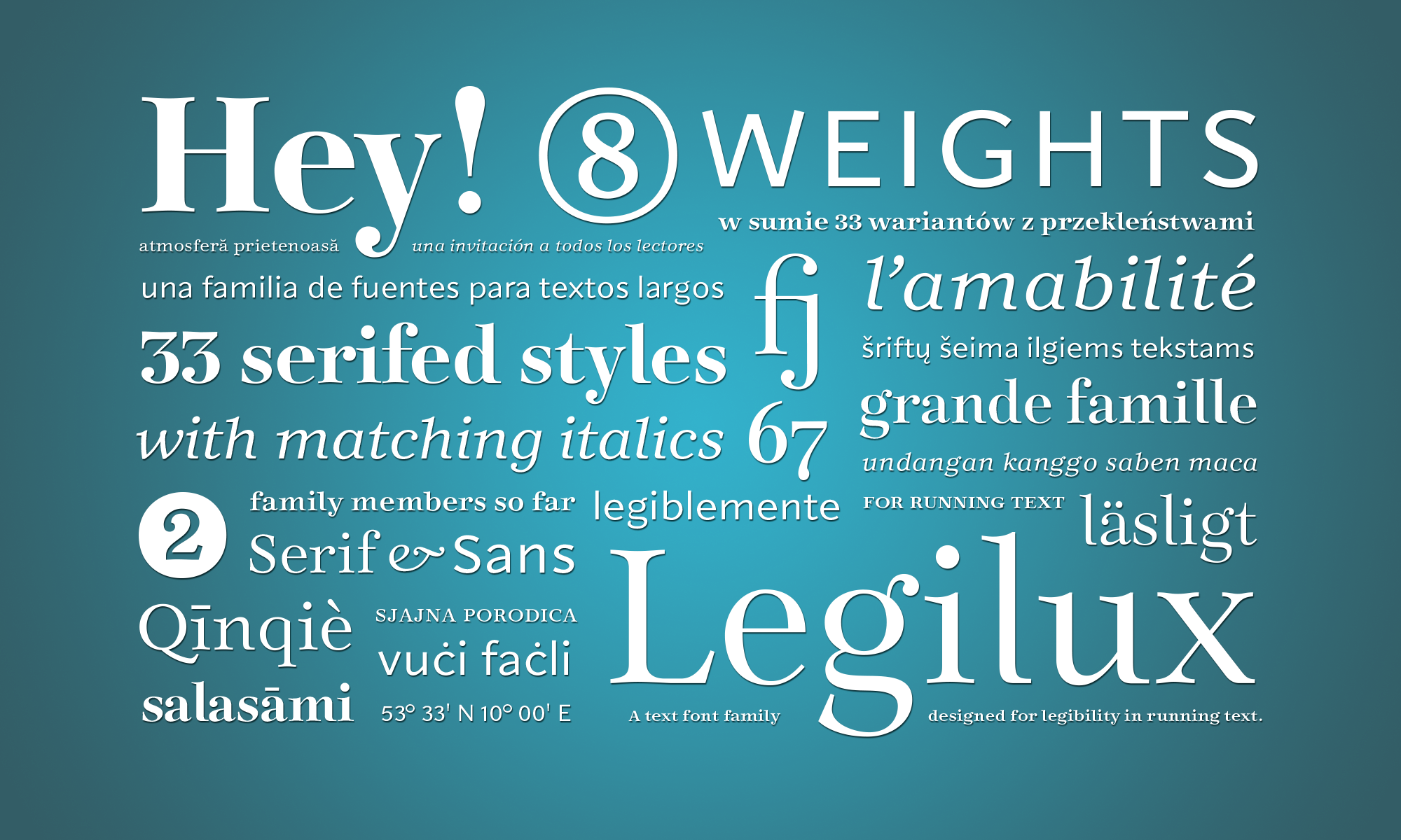
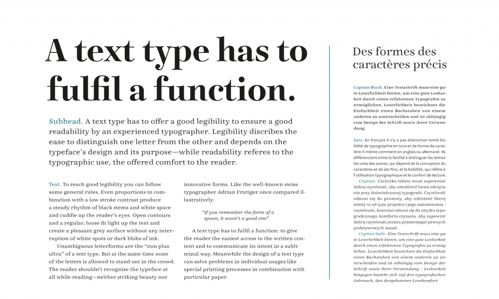
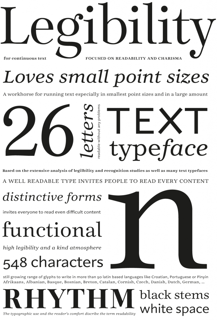
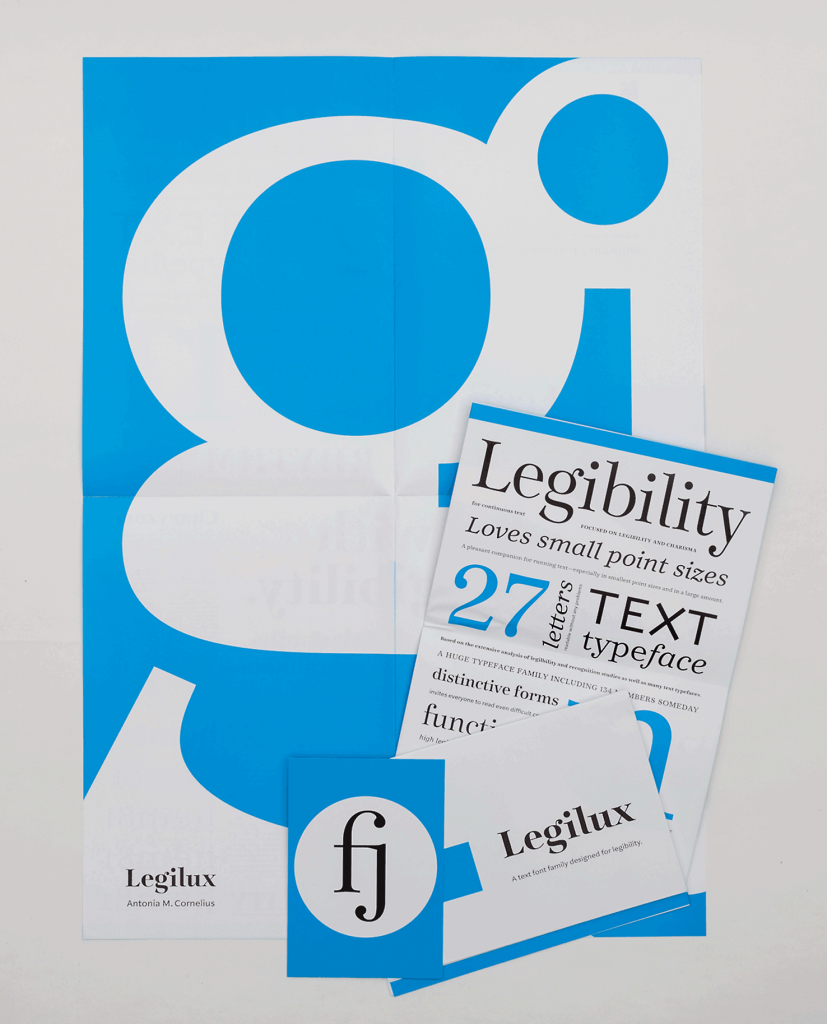
Legilux is a text typeface family designed for best legibility in running text. Beside its clearness Legilux offers a warm and friendly atmosphere—a true invitation for every observer to become a reader.
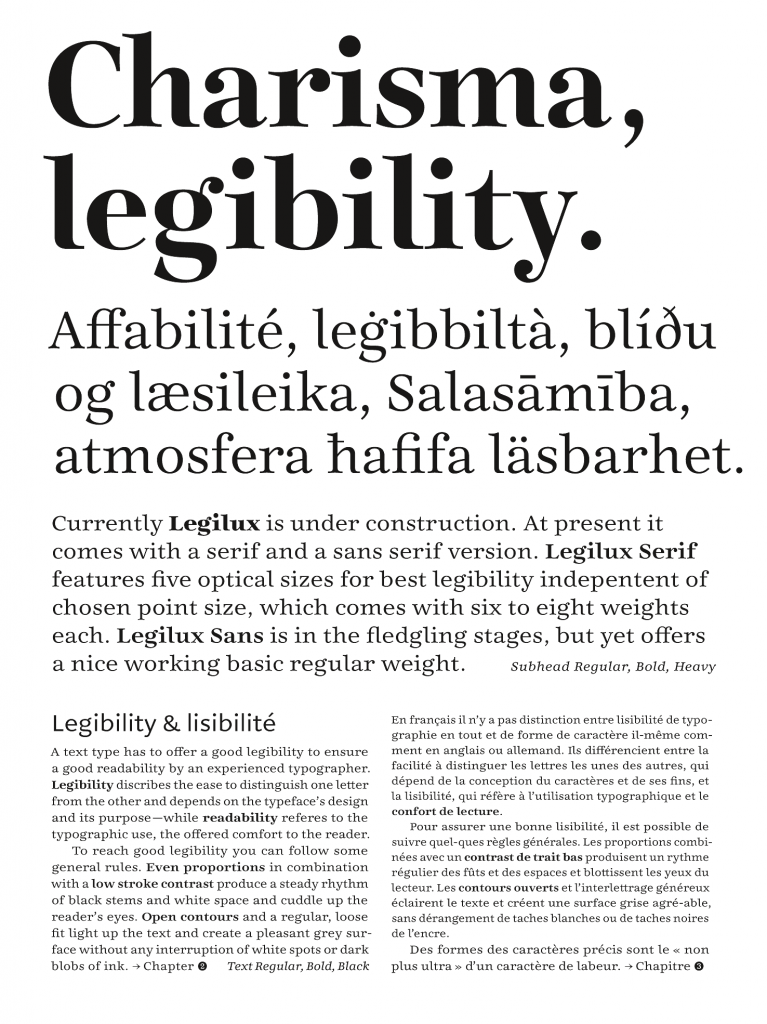
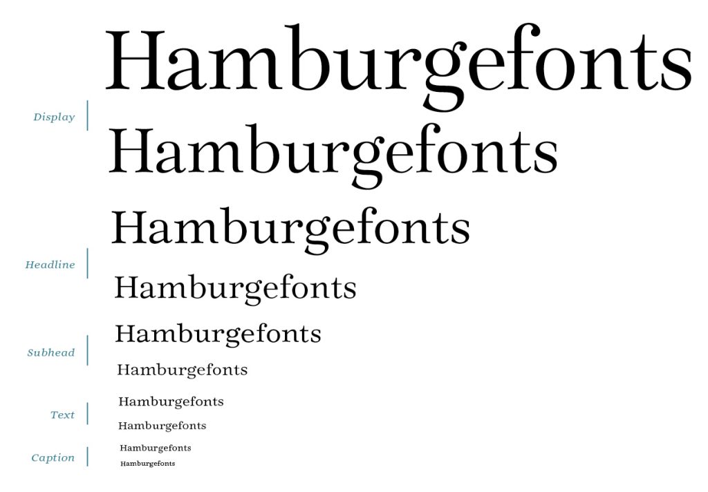
Legilux is constantly evolving. At present, it comes with a serif as well as a sans serif version. Legilux Serif features five optical sizes for best legibility independent of chosen point size, which come with six to seven weights each. Legilux Sans is in the fledgling stages, but yet offers a nice working and very legible regular weight. A sans serif with higher stroke contrast and a slab serif are in progress as well.
The design method “optical scaling” is in fact pretty old, deriving from punch cutting. Here, the design of each letter is specifically designed for one single point size. In this way, proportions, stroke thicknesses as well as design details depend on the particular size. Thus, especially the legibility but also the personality of a typeface get preserved independent from chosen point size.
Legilux’ design combines clearness for functional legibility with smooth forms for an inviting atmosphere. Its steady rhythm of black strokes and white space generates a comfortable reading flow. The expanded character set with numerous diacritics supports a wide range of latin-based languages. Implemented OpenType Features enhance legibility and readability by offering ligatures or diverse sets of figures. Moreover, stylistic alternates and symbols expand design possibilities.
A very early version of Legilux Serif already won the 1st Public Choice Award of the Morisawa Type Design Competition 2016. In 2017, the significantly revised Legilux Serif passes its first practical test in the publication “The Letters in my Head”. Here, all captions and annotations are set in Legilux Serif Caption, and other styles and weights are used for several illustrations.
By now, the Legilux family is not available due to essential reworking for a proper setup as a functional superfamily in the variable age. But if you got attracted don’t hesitate to get in touch! Meanwhile, head over to legilux-typeface.com for even deeper insights.
Featured in:
Popova, Yulia: How many female type designers do you know? I know many and talked to some!, p. 268. Eindhoven: Onomatopee 2020.
Gaspar, Natalie & Sommer, Patrick Marc: Das ABC der Typografie. Grundlagen, Definitionen, Praxisanwendung. Typografie verständlich beschrieben, p. 19, 121, 139. Bonn: Rheinwerk Verlag 2020.
Muthesius University of Fine Arts and Design: Einblick/Ausblick 2018. Jahreskatalog der Muthesius Kunsthochschule, p. 19, 121, 139. Kiel 2018.
Cornelius, Antonia M.: Buchstaben im Kopf. Was Kreative über das Lesen wissen sollten, um Leselust zu gestalten. Mainz: Hermann Schmidt, 2017.


